
They might be considered cliché; however, they might also be very true. The following are five diagrams that frequently work their way into slide decks about green building design and construction. You should be familiar with all of these. Let's unpack each one briefly—going back to primary source material and acknowledging attribution.
Rogers' Innovation Adoption Curve
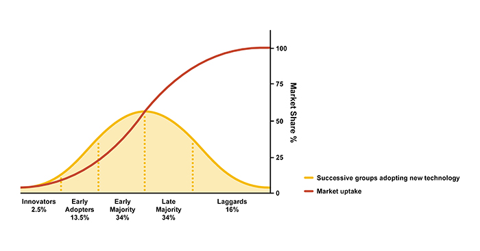
This chart actually represents two figures by the late Everett Rogers, a professor of communication studies at the University of New Mexico, as defined in his 1962 book Diffusion of Innovation. It is a book chock-full of research regarding the influence of communication channels on trends of market uptake for new innovations.
As exhibited below, the red S-curve represents what Rogers coined as the "diffusion of innovation"—a process by which an innovation is communicated through certain channels over time among the members of a social system. The yellow depicts adopter categorization on the basis of innovativeness. Rogers referred to this as the "innovativeness dimension" - the trend by which an individual adopts an innovation over time. Rogers also partitioned this variable into five adopter categories by laying off standard deviations from the average time of adoption.
|
|
|
Figure 1: Rogers' Innovation Adoption Curve. Rogers' diffusion of innovation curve (red) and adopter categorization on the basis of innovativeness (yellow). Adapted from Everett M. Rogers, Diffusion of Innovation (1962). Illustration by Daniel Overbey. |
The (3-Set) Venn Diagram
This diagram is attributed to the John Venn, a nineteenth century English logician and philosopher, who introduced the it through his work in the fields of set theory, probability, logic, statistics and computer science. The Venn Diagram shows all possible logical relations between a finite collection of different sets. Depending on the number of sets, the diagram can take on different variations.
Venn diagrams (and Euler diagrams; do not conflate the two) were incorporated into set theory instruction as part of the new math movement in the 1960s. Since then, they have also been adopted in the curriculum of other fields—such as architectural design, where the 3-set Venn diagram is often used to illustrate John Elkington's concept of the "triple bottom line" in sustainable development by which economic, social and environmental priorities are interrelated and equally valued.
|
|
|
Figure 2: The classic 3-set Venn Diagram. Illustration by Daniel Overbey. |

The MacLeamy Curve
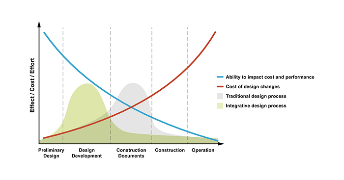
Former HOK Chairman Patrick MacLeamy is credited with articulating the concept of "shifting the effort” with regard to design development, otherwise known as the MacLeamy Curve. The diagram illustrates the notion that the further a project team is through the design process, the greater the cost of design changes.
The MacLeamy Curve has been leveraged by advocates of integrated project delivery (IPD), building information modeling (BIM), design performance modeling (DPM) and other frameworks/platforms that foster an integrative process.
The premise of the MacLeamy Curve is that an integrative process shifts design efforts toward the front-end of a project timeline—where there is maximum flexibility to make high-impact design decisions and interdisciplinary efforts are coordinated much sooner versus a more traditional design process.
Side note: While MacLeamy is credited with first introducing his eponymous diagram in a 2004 white paper from the Construction Users Roundtable, Boyd C. Paulson crafted a very similar diagram in a 1976 white paper for the Journal of the Construction Division.
|
|
|
Figure 3: The MacLeamy Curve. This diagram illustrates the notion that the further a project team is through the design process, the greater the cost of design changes. It makes a strong case for an integrative design process. Illustration by Daniel Overbey. |
Maslow's Hierarchy of Needs
A popular framework in psychology and/or sociology research, management training, and other fields of study, the American psychologist Abraham Maslow's "hierarchy of needs" proposed that people are motivated to achieve certain needs and that some needs take precedence over others. Our most fundamental need is for physical survival; therefore, this will be the first thing that motivates our behavior. Once that level is fulfilled, the next level up is what most motivates us, and so on.
Following a white paper in 1943, Maslow's theory was fully expressed in his 1954 book Motivation and Personality. His five-stage model can be divided into deficiency motivations and growth motivations. The first (bottom) four levels define deficiency motivations and are said to prompt people to behave in order to seek certain needs they are deprived of. The last (top) level encompasses growth motivations, which prompt people to behave from a need to grow as a person toward self-actualization.
With the emerging priorities of health and wellness in building design and construction, Maslow's hierarchy of needs is becoming a frequently cited point of departure for discussions around environmental quality, social connectivity, nutrition, and other topics.
|
|
|
Figure 4: Maslow's hierarchy of needs. Illustration by Daniel Overbey. |

Jevons Paradox
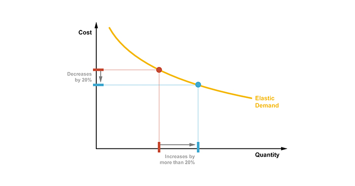
The 19th-century English economist William Stanley Jevons observed that as technological improvements made coal-use more efficient, the consumption of coal increased across a wide range of industries. Jevons' theory is that, contrary to common intuition, technological advancement could not be relied upon to reduce overall fuel consumption.
As I pointed out in a TEDx talk a few years ago, Jevons paradox appears to hold true with regard to US residential energy consumption. For all of our improvements in energy-efficient design and construction, appliances, electronics and so on, our overall energy use has continued to increase. We simply keep adding more stuff—larger homes, more gadgets, etc.
Jevons paradox is an economic theory contingent on the elasticity of demand for a good. An elastic demand is highly responsive to price. (e.g, If energy costs are cheap, we have a tendency to use a lot more of it.) On the other hand, goods with inelastic demand will not exhibit the Jevons paradox because the price reduction from increased efficiency will not sufficiently increase demand.
|
|
|
Figure 5: Jevons Paradox. Jevons' economic theory relates to goods with an elastic demand. For example, a 20 percent increase in efficiency may causes a 40 percent increase in quantity demanded. Illustration by Daniel Overbey. |

Recent Comments
These are actually very helpful tips. It is...
This is the most beneficial blog for all...
This blog is a great resource for anyone...
Thank you for sharing this important information. I...
This is a very interesting subject of the...